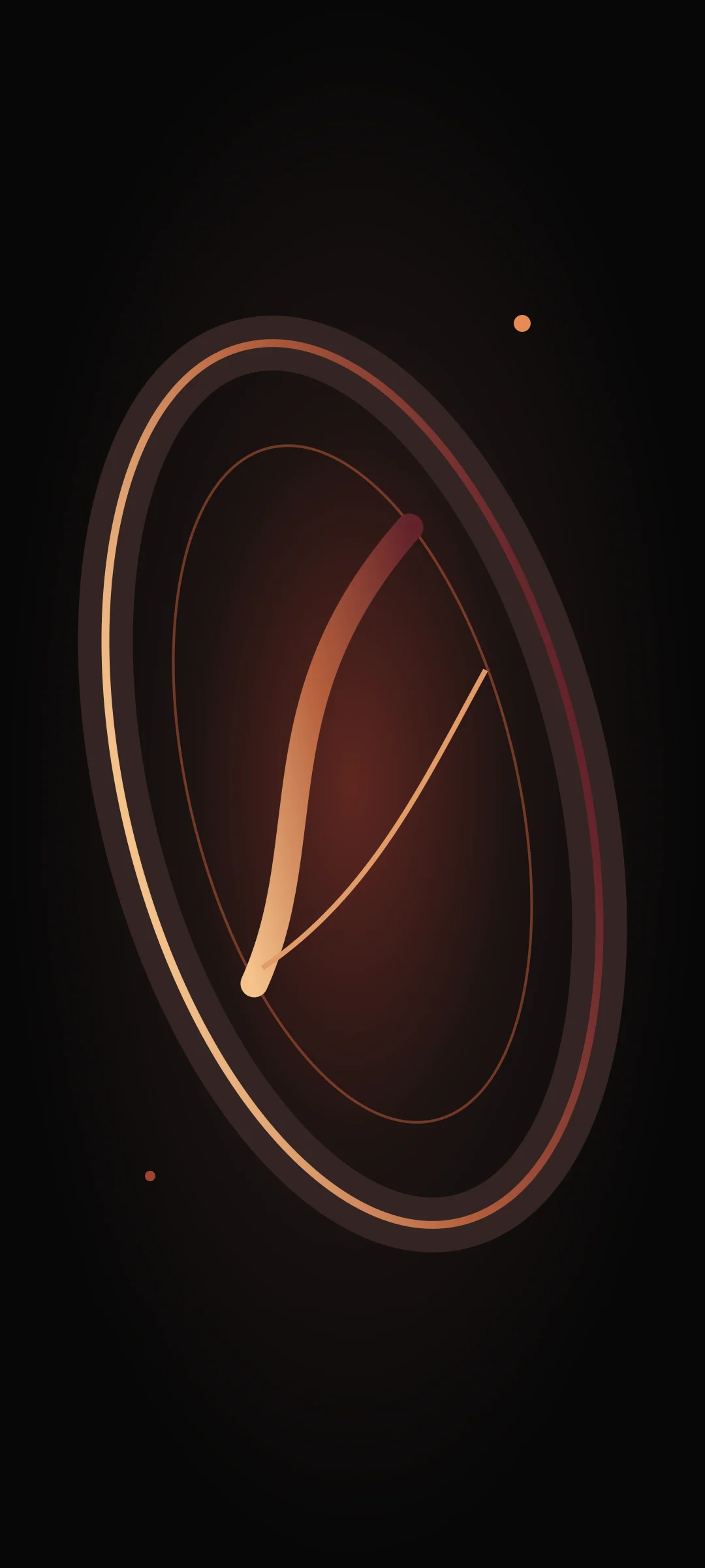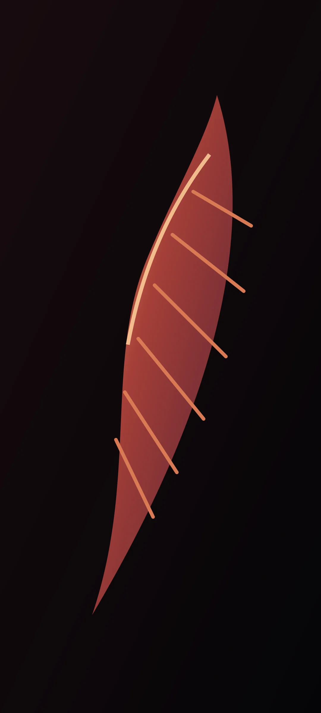
The familiar black-and-orange combination becomes more editorial when orange is treated as light rather than fill. Copper adds a middle value that connects the hottest point to the darkest background.
Assign a role to each color
Graphite carries the visual field, copper describes form, and ember orange identifies the few hottest points. Burgundy can soften the transition without turning the image brown.
Texture before saturation
Fine texture helps dark planes feel material. Instead of raising saturation, use small changes in surface grain, edge sharpness and value to distinguish stone, smoke and feather.
Design around interface clutter
Keep the busiest detail away from common icon rows. Readability depends on local contrast, not only the image’s overall drama.
- Reserve the lightest value for one focal area.
- Use copper as a bridge, not a second highlight.
- Test with a representative icon layout.
Sources and review notes
Sources are linked for context and verification. They do not imply endorsement of EmberScreen.
Editorial profile: This article is signed by the institutional Editorial Desk because no verified individual contributor profile has been supplied for this production draft. Read the profile.